

Orangetown Diner –Complete Brand Rebrand & Marketing Development
client
Orangetown Diner / Tenafly Diner
role
Brand Identity Development
LOCATION
Orangetown, NY / Tenafly, NJ
year
2023 - Present
Sky Marketing US partnered with Orangetown Classic Diner to execute a full-scale rebrand that modernized the diner’s visual identity while preserving its nostalgic, all-American charm. Our goal was to elevate the restaurant’s brand presence—both in-store and across all customer touchpoints—ensuring a cohesive, memorable, and market-ready identity aligned with current dining trends.
Brand Identity Development
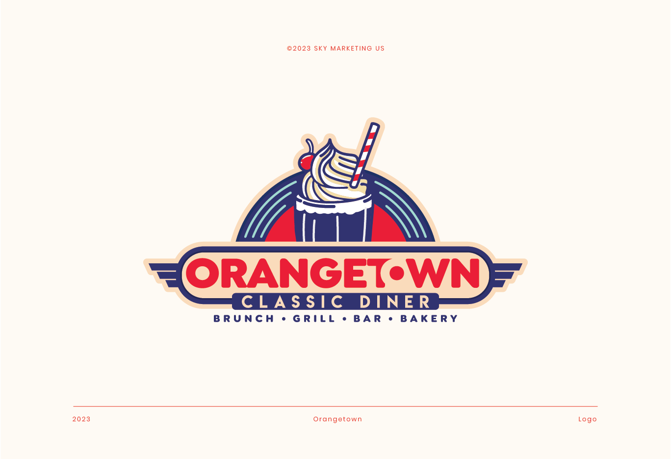
Logo Redesign
We created a bold, retro-inspired logo featuring a signature milkshake illustration, symbolizing Orangetown’s fun, family-friendly diner experience.
The new logo system includes:
- Primary full-color logo
- Black/white positive & negative applications
- Scalable versions for print, apparel, signage, packaging, and digital use
- Wing-style accents referencing classic diner Americana
This new identity serves as the foundation for all visual communication.
Typography & Color System
Sky Marketing developed a custom brand font system using:
- Passion One for bold, energetic headlines
- Futura Extra Black BT for structured, high-impact readability
- Seventies Sunrise Regular for nostalgic character accents
The curated brand color palette includes:
- Deep Koi Maru Navy
- Alizarin Crimson
- Peach Puff
- Pale Robin Egg Blue
These tones were selected to evoke a retro diner aesthetic while maintaining modern vibrancy and versatility across print and digital platforms.
In-Store Visual Experience
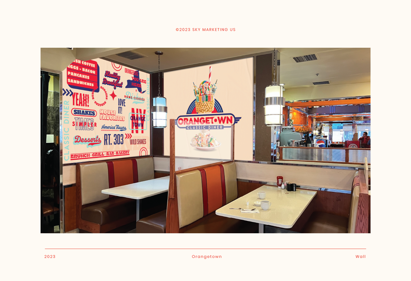
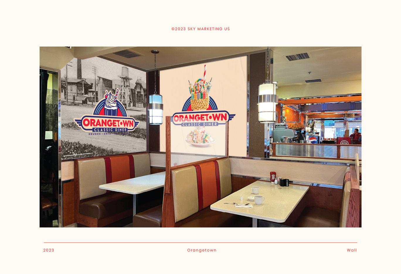
Interior Wall Graphics
We designed custom wall art to energize the dining environment and unify the brand identity with the physical space.
Deliverables included:
- Full typographic mural with diner-themed expressions and directional graphics
- Milkshake feature wall showcasing the signature dessert program
- Color and theme integration tailored to the existing interior architecture
These installations enhance customer experience and strengthen brand recall.
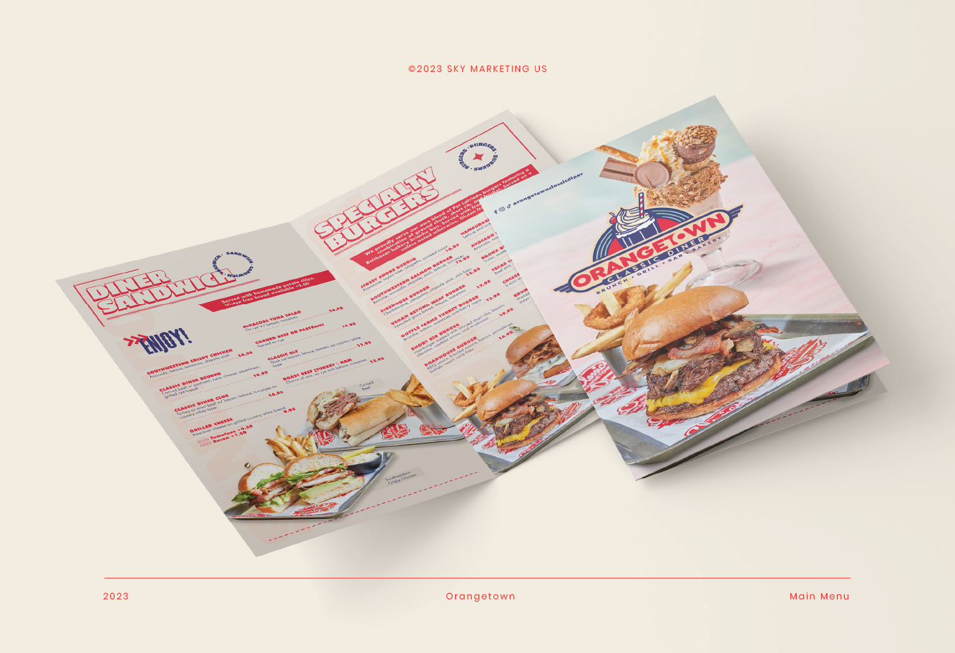
Menu System Redesign
Sky Marketing US produced a complete menu suite, including:
Main Menu
- Full layout redesign with strong hierarchy and improved readability
- High-quality photography direction showcasing hero items
- Category restructuring for a more intuitive customer journey
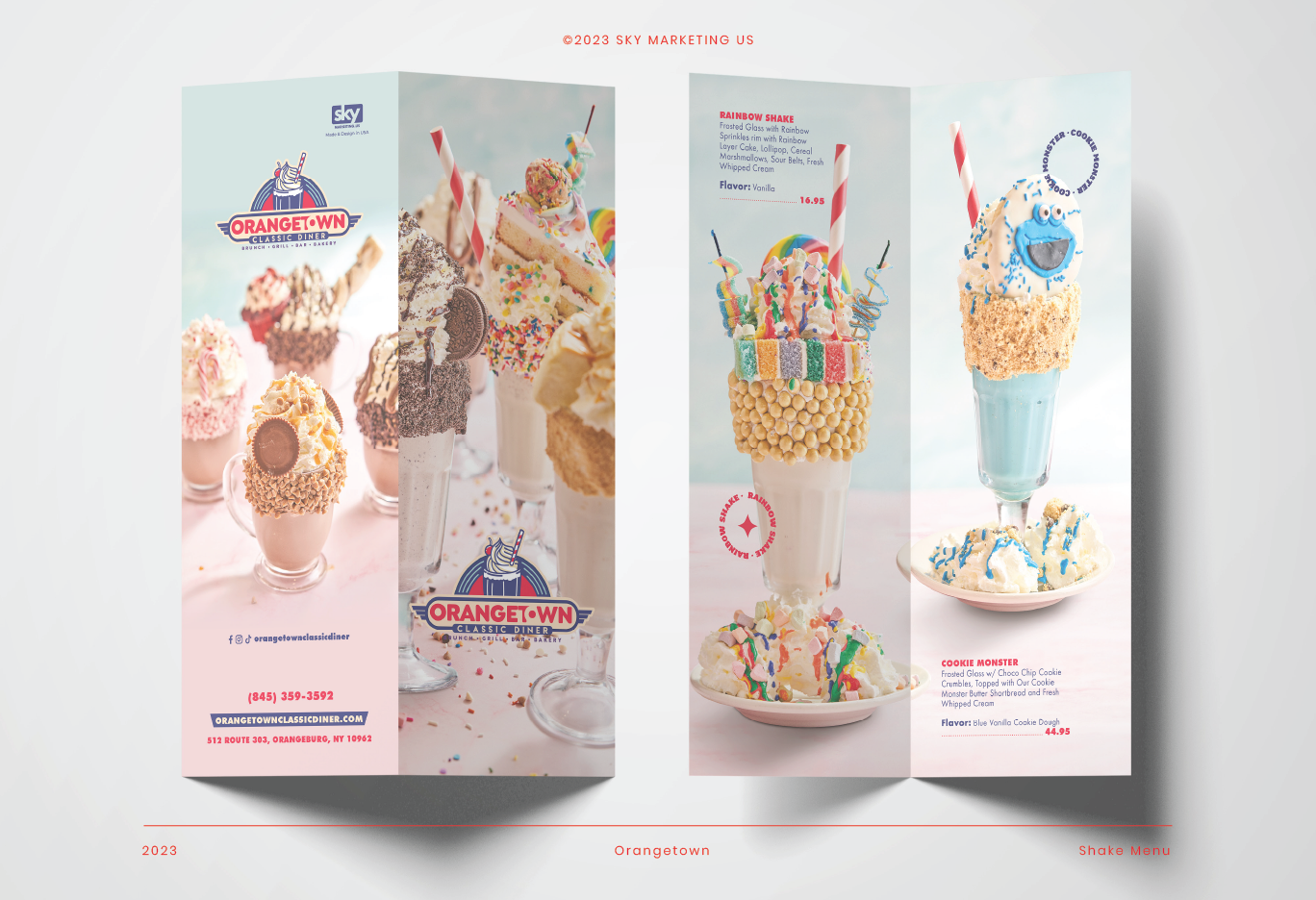
Signature Shake Menu
- Vibrant, specialty shake-focused tri-fold menu
- Custom product illustrations and photos of the Rainbow Shake, Cookie Monster Shake, and others
- Elevated desserts into a branded “Wild Shakes” category
These menus positioned Orangetown as a destination diner with premium offerings.
Marketing Collateral & Brand Applications
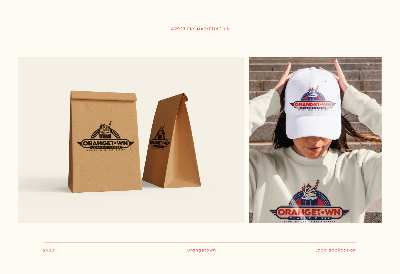
We extended the new brand identity across tangible customer interactions, such as:
- Takeout packaging (paper bags with branded marks)
- Staff apparel & hats featuring full-color logo
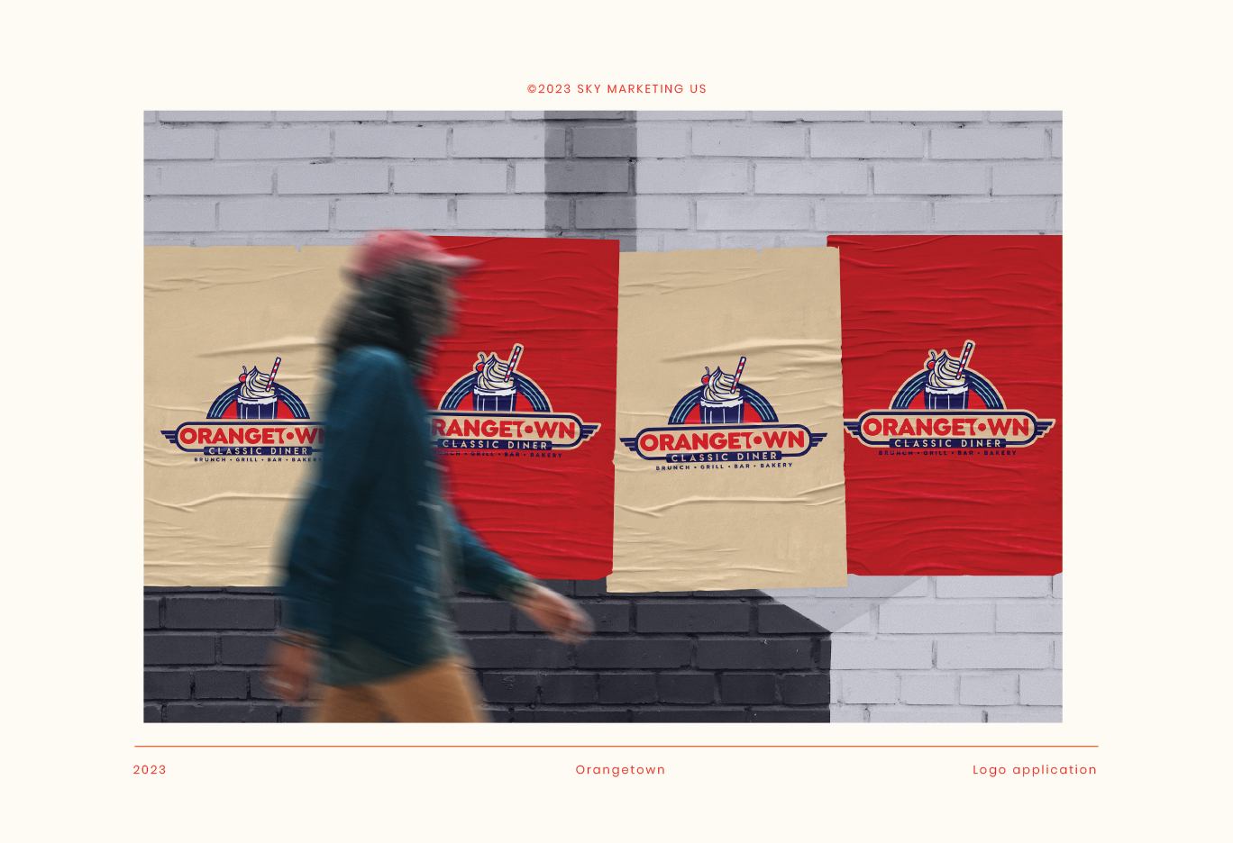
- Outdoor & street poster campaigns using textured mockups and color-blocked layouts
This ensured consistent visibility and a professional, unified appearance across all marketing and operational materials.
Digital-Ready Brand Assets
All assets were delivered in formats optimized for:
- Website & social media use
- Google Ads & online ordering platforms
- Additional marketing expansions
This guarantees long-term usability as Orangetown continues to grow its digital presence.
.jpg)
.png)

.svg)